MyKidzHealth: After-Hours Pediatric Care Platform for Ontario Families
A calm, trustworthy healthcare landing experience for Ontario families seeking after-hours pediatric guidance when clinics are closed.
Client Overview
MyKidzHealth is an Ontario-focused pediatric care platform helping families connect with licensed clinicians from home during evenings, nights, weekends, and other moments when traditional clinics are closed.
The public experience includes a long-form parent-facing landing page plus a dedicated provider application route for clinicians who want to join the care network. That means the site has to speak to two audiences with very different motivations: worried parents and licensed healthcare providers.
For families, the experience needed to feel calm, direct, and trustworthy. Parents visiting the site may be stressed, tired, or uncertain about what to do next. The design and copy needed to reduce anxiety rather than amplify urgency.
For providers, the site needed to explain the opportunity clearly and professionally. Doctors and nurse practitioners need to understand the platform’s focus, schedule expectations, application requirements, and clinical seriousness before submitting interest.
The result is a two-sided web presence: a parent funnel for early access and a provider funnel for clinician recruitment. Both use the same brand system, but each route prioritizes the information that audience needs most.
Services Provided
Solution Technologies / Tech Stack
The Challenge
Healthcare landing pages carry a higher trust burden than ordinary service websites. Parents need quick clarity, but they also need reassurance that the service is clinically credible, practical, and designed around real family stress.
The challenge was to make an early-stage care model understandable without overpromising. The site had to explain after-hours access, pediatric focus, avoidable ER visits, clinician types, treatable conditions, pricing direction, and waitlist conversion in one cohesive journey.
The messaging also had to be careful. MyKidzHealth is not positioned as an emergency replacement; it is an access layer for licensed guidance when families need help outside normal clinic hours. The site needed to respect that distinction while still showing the value of faster, more convenient pediatric support.
The parent-facing page had to cover a lot of ground without feeling overwhelming. It needed to explain the problem, show how the service works, clarify what conditions can be handled, introduce the care team, communicate availability, preview pricing, and drive waitlist conversion.
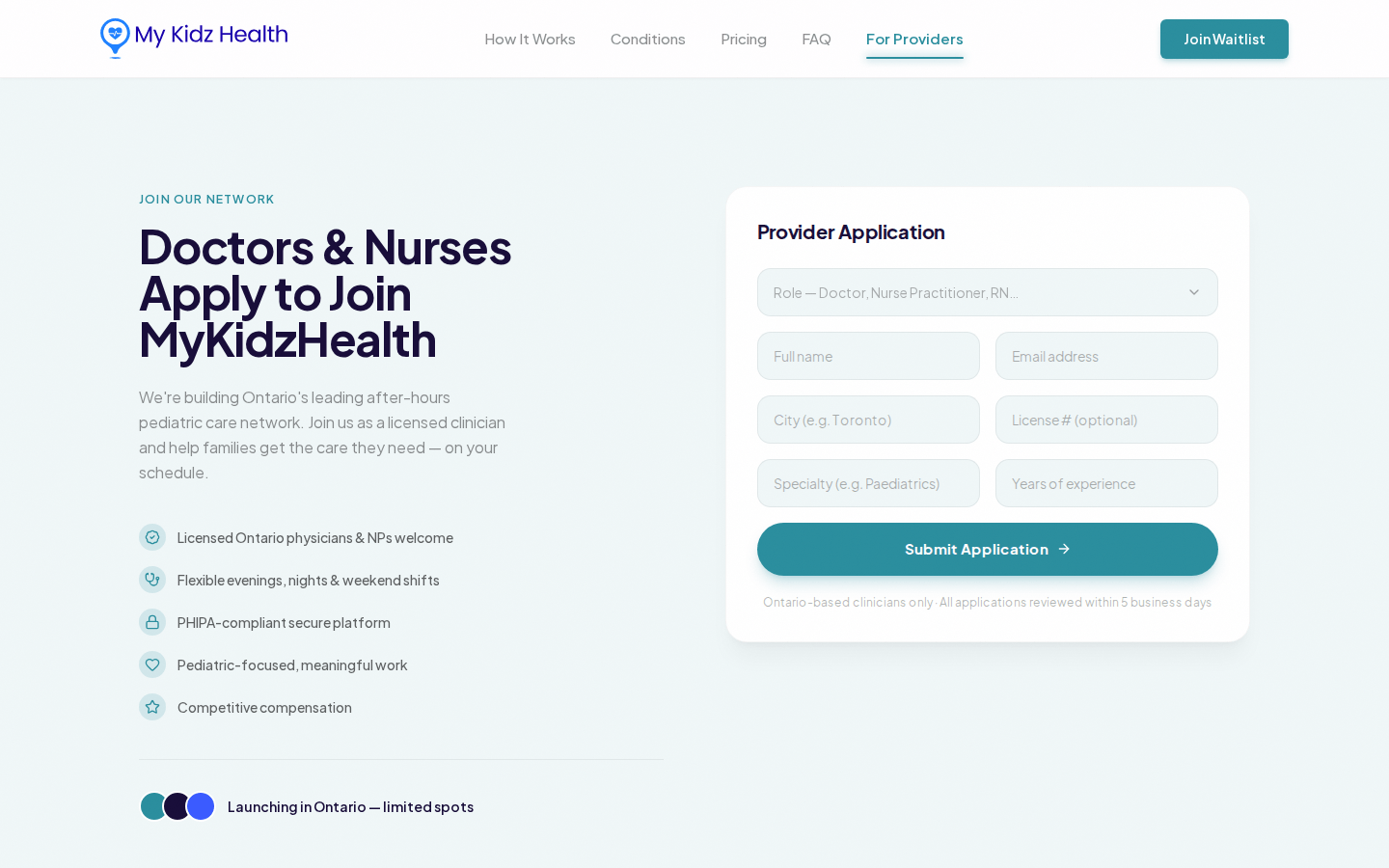
The provider side added another layer of complexity. A care platform needs clinical supply, not just family demand. The site needed a separate provider route that could attract doctors and nurse practitioners while maintaining the same level of professionalism and trust.
The visual challenge was restraint. A healthcare product should not feel like a loud startup pitch. It needed a calm interface, clear typography, soft colors, and enough human warmth to reassure families while keeping the service credible.
The Solution
We built the parent-facing landing page as a guided healthcare funnel and supported it with a separate provider route for doctors and nurses. The family journey explains after-hours care, conditions, pricing, and waitlist access, while the provider route supports clinician recruitment.
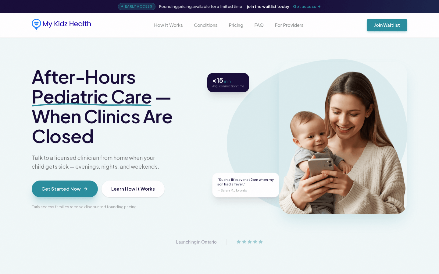
The homepage leads with the emotional moment: a child is sick when clinics are closed. From there, the page explains the service through clear sections: the problem, why choose the platform, how it works, what conditions can be supported, who the clinicians are, when care is available, pricing, and waitlist signup.
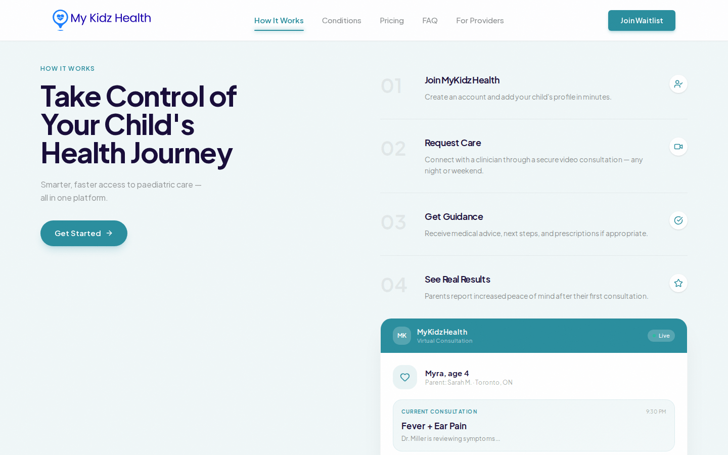
The how-it-works section makes the product feel concrete. It turns the service into four understandable steps: join, request care, get guidance, and see results. This gives parents a mental model before asking them to join the waitlist.
The conditions section clarifies scope. Instead of vague healthcare claims, it lists the kinds of common childhood concerns the service can support and keeps the experience grounded in practical use cases.
The provider route gives clinicians their own pathway. It explains the opportunity, highlights flexible after-hours work, communicates pediatric focus, and provides an application form for relevant professional details.
Together, the two journeys give MyKidzHealth a stronger launch foundation. Families can join early access, and licensed clinicians can apply to help build the care network.
Designing for Calm, Clarity, and Confidence
The visual direction uses generous spacing, soft blues, deep navy typography, rounded components, and human imagery to create a calm healthcare experience. The design avoids urgent or alarmist styling while still making the next step clear.
Interactive-looking cards and the virtual consultation mockup make the service feel tangible before the product is fully available, helping parents understand what an after-hours interaction could look like.
The design language is consistent across the parent and provider experiences, but the hierarchy changes by audience. Parents see reassurance, care flow, and waitlist actions. Providers see professional benefits, application fields, and network positioning.
We used simple, direct navigation anchors so the page feels manageable despite covering many topics. A visitor can jump to how it works, conditions, pricing, FAQ, provider information, or waitlist depending on their intent.
The typography and spacing are intentionally quiet. In a pediatric care context, trust comes from clarity and composure, not visual intensity. The interface gives the content enough room to breathe and keeps CTAs visible without making the page feel aggressive.
For mobile users, the design keeps the most important actions close. Parents can understand the promise, review the care steps, check availability, and join the waitlist from a phone without navigating a complex app-like flow.
- Clear hero message for after-hours pediatric care in Ontario.
- Step-by-step care journey from profile creation to guidance and prescriptions if appropriate.
- Condition tags that explain the range of childhood concerns the service can support.
- Availability section that makes evenings, weekends, and holidays concrete.
- Waitlist and pricing sections designed for early-access conversion.
- Provider application route for doctors and nurse practitioners.
- Calm healthcare design language that avoids fear-driven conversion tactics.
Careful Messaging for a Sensitive Healthcare Context
We shaped the content around trust and accuracy. The site positions MyKidzHealth as access to licensed clinicians and guidance, while avoiding language that would imply emergency replacement or guaranteed outcomes.
A major part of the work was making the service feel understandable without requiring visitors to read policy-heavy copy. The clinical trust markers are present, but the experience stays focused on parent questions: when can I get help, who will help, what can they treat, and how do I join?
The provider page extends the same care into recruitment. It gives licensed clinicians a focused application path and communicates that the platform is pediatric-focused, Ontario-based, and designed around flexible after-hours care.
The long-form structure allowed us to build confidence gradually. Instead of asking for a waitlist signup immediately and leaving questions unanswered, the page walks visitors through the need, the service, the team, the timing, the price point, and the next step.
We also planned the content for future iteration. As the platform validates pricing, provider availability, care kit details, and operating processes, the current structure can absorb more information without needing a full redesign.
The result is a launch-ready healthcare website that supports validation, waitlist growth, and provider conversations while leaving room for clinical and operational details to evolve.
- Parent-focused copy that emphasizes reassurance and practical next steps.
- Clinical credibility through Ontario-licensed clinician messaging.
- Responsive layout for mobile-first parent use.
- Early-access funnel built around waitlist conversion.
- Provider application route for clinician network growth.
- Careful positioning that avoids emergency-care overclaims.
- Flexible content structure for future service and pricing updates.
The Result
The site presents MyKidzHealth as a trustworthy pediatric care option, supports early-access signups, and gives families a clear explanation of how after-hours virtual care works across Ontario.
The parent-facing page now has a complete education and conversion path: problem framing, service benefits, consultation flow, treatable conditions, clinician types, availability, pricing, and waitlist capture.
The provider page adds a second growth channel by giving doctors and nurse practitioners a dedicated place to understand the opportunity and submit an application. That helps the platform build both demand and clinical supply from the same public web presence.
The design gives the brand a credible healthcare foundation before the product is fully scaled. It can support early conversations with families, clinicians, partners, and stakeholders because it explains the model in a clear and professional way.
The page structure also makes future growth easier. Pricing, care kit details, provider FAQs, conditions, and operating hours can all be adjusted as the service evolves without rebuilding the core user journey.
Most importantly, the website makes a sensitive healthcare idea feel approachable. It gives parents enough clarity to take the next step while preserving a calm, credible tone appropriate for pediatric care.
What Our Clients and Team Say
"The challenge was to make after-hours pediatric care feel clear and credible without making the page feel clinical or intimidating. Every section was designed to reduce uncertainty for parents."
"MyKidzHealth needed to speak to families and providers at the same time. The final structure gives each audience a focused path while keeping the brand calm, trustworthy, and easy to understand."